【Android】自定义 View
vecrates
12月 14, 2017
自定义 View,通常通过重写 View 中的部分方法实现,在 View 中比较重要的回调方法,可根据需要重写其中的方法:
onFinishInflate(),加载完 xml 文件回调
onSizeChanged(),view大小改变时回调
onMeasure(),测量View大小位置
onLayout(),确定显示位置
onTouchEvent(),触摸事件回调
实现自定义 View 的途径:
- 对现有控件进行扩展
- 对现有控件进行组合
- 重写全新控件
对现有控件进行扩展
实现过程:
1). 继承现有控件
2). 重写 onDraw() 方法
一个扩展 TextView 控件,实现渐变样式的 TextView,效果图

实现代码:
/**
 * author: vecrates
 */
public class MyTextView extends TextView {

    private int mViewWidth;
    private int mViewHeight;
    private LinearGradient mLinearGradient;
    private Matrix mMatrix;
    private int mTranslate = 0;

    public MyTextView(Context context, AttributeSet attrs) {
        super(context, attrs);
    }

    @Override
    protected void onFinishInflate() {
        super.onFinishInflate();
        Log.v("_v", "onFinishFlate");
    }

    /**
     * 测量view大小及位置
     * @param widthMeasureSpec
     * @param heightMeasureSpec
     */
    @Override
    protected void onMeasure(int widthMeasureSpec, int heightMeasureSpec) {
        super.onMeasure(widthMeasureSpec, heightMeasureSpec);
        Log.v("_v", "measureSpec: " + widthMeasureSpec + " " + heightMeasureSpec);
    }

    /**
     * 组件大小改变时回调
     * @param w
     * @param h
     * @param oldw
     * @param oldh
     */
    @Override
    protected void onSizeChanged(int w, int h, int oldw, int oldh) {
        super.onSizeChanged(w, h, oldw, oldh);
        Log.v("_v", "onSizeChanged ");
        if (mViewWidth == 0) {
            mViewWidth = getMeasuredWidth();
            mViewHeight = getHeight();;
            Paint paint = getPaint();  //获得当前绘制的paint对象
            mLinearGradient = new LinearGradient(0, 0, mViewWidth, mViewHeight,
                    new int[] {Color.RED, Color.BLUE}, null, Shader.TileMode.CLAMP);
            paint.setShader(mLinearGradient); //给paint添加linearGradient
            mMatrix = new Matrix();
        }

    }

    /**
     * 绘制view
     * @param canvas
     */
    @Override
    protected void onDraw(Canvas canvas) {
        Log.v("_v", "onDraw");
        Paint paint = new Paint();
        paint.setColor(Color.YELLOW);
        paint.setTextSize(20f);
        paint.setStyle(Paint.Style.FILL_AND_STROKE);
        canvas.drawRect(0, 0, mViewWidth, mViewHeight, paint);
        super.onDraw(canvas);
        if(mMatrix != null) {
            mTranslate += mViewWidth;
            if(mTranslate > mViewWidth) {
                mTranslate = 0;
            }
            mMatrix.setTranslate(mTranslate, 0);
            mLinearGradient.setLocalMatrix(mMatrix);
            postInvalidateDelayed(100); //刷新UI
        }
    }

}
在 xml 中使用自定义 View
    <cn.vecrates.androidjinjie.MyTextView
        android:layout_width="wrap_content"
        android:layout_height="wrap_content"
        android:padding="20dp"
        android:text="TextView拓展"
        android:textSize="20sp"
        android:textColor="@android:color/black"
        />
创建复合控件
实现过程:
1) 根据需要自定义属性,指定属性名称及类型。通常情况下需要自定义属性来满足创建的控件,但这个是非必须的
2) java 类继承 ViewGroup ,并从 xml 中读取自定义属性的值。这里的 ViewGroup 不单是指 ViewGroup 类,还可以是以ViewGroup类为基类的类
3)根据需要生成子控件,并把获取到的 xml 值赋给相应的 View,把子控件组合生成组合控件。
4)使用控件
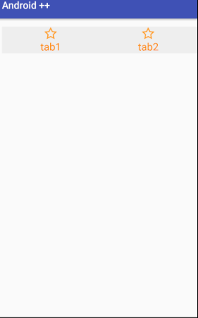
简单地实现一个 app 中常用的底部导航栏
1):
<?xml version="1.0" encoding="utf-8"?>
<resources>
    <declare-styleable name="ButtonBar">
        <attr name="tab1Icon" format="reference"/>
        <attr name="tab2Icon" format="reference"/>
        <attr name="tab1Text" format="string"/>
        <attr name="tab2Text" format="string"/>
        <attr name="tabTextColor" format="color"/>
        <attr name="tabIconWidth" format="dimension"/>
        <attr name="tabIconHeight" format="dimension"/>
        <attr name="tabTextSize" format="dimension"/>
        <attr name="tabBackground" format="reference|color"/>
    </declare-styleable>
 </resources>
2) 3):
/**
 * author: Vecrates.
 * describe: 此控件简单地仿常用 app 上的底部导航栏
 */
public class MyButtonBar extends LinearLayout {
    // buttonBar 属性
    private Drawable mTab1Icon;
    private Drawable mTab2Icon;
    private String mTab1Text;
    private String mTab2Text;
    private int mTabTextColor;
    private float mTabIconWidth;
    private float mTabIconHeight;
    private float mTabTextSize;
    //此 buttonBar 的子 view 组件
    private LinearLayout mTab1Layout;
    private LinearLayout mTab2Layout;
    private ImageView mTab1ImageView;
    private ImageView mTab2ImageView;
    private TextView mTab1TextView;
    private TextView mTab2TextView;

    private IButtonBarOnClickListener mOnClickListener;

    public MyButtonBar(Context context, AttributeSet attrs) {
        super(context, attrs);
        //从 xml 中获取自定义的属性集
        TypedArray ta = context.obtainStyledAttributes(attrs, R.styleable.ButtonBar);
        //从自定义属性集中获取值,以便为对应的 view 赋值
        mTab1Icon = ta.getDrawable(R.styleable.ButtonBar_tab1Icon);
        mTab2Icon = ta.getDrawable(R.styleable.ButtonBar_tab2Icon);
        mTabIconWidth = ta.getDimension(R.styleable.ButtonBar_tabIconWidth, 10);
        mTabIconHeight = ta.getDimension(R.styleable.ButtonBar_tabIconHeight, 10);

        mTab1Text = ta.getString(R.styleable.ButtonBar_tab1Text);
        mTab2Text = ta.getString(R.styleable.ButtonBar_tab2Text);
        mTabTextColor = ta.getColor(R.styleable.ButtonBar_tabTextColor, 0);

        mTabTextSize = ta.getDimension(R.styleable.ButtonBar_tabTextSize, 10);

        //资源回收,避免重新创建时发生错误
        ta.recycle();
        init();
    }

    private void init() {
        //创建 view,并把从 xml 文件中获得的值赋给相应的子 view
        mTab1ImageView = new ImageView(getContext());
        mTab2ImageView = new ImageView(getContext());
        mTab1ImageView.setImageDrawable(mTab1Icon);
        mTab1ImageView.setLayoutParams(new LayoutParams((int)mTabIconWidth, (int)mTabIconHeight));
        mTab2ImageView.setImageDrawable(mTab2Icon);
        mTab2ImageView.setLayoutParams(new LayoutParams((int)mTabIconWidth, (int)mTabIconHeight));

        mTab1TextView = new TextView(getContext());
        mTab2TextView = new TextView(getContext());
        mTab1TextView.setText(mTab1Text);
        mTab1TextView.setTextSize(mTabTextSize);
        mTab1TextView.setTextColor(mTabTextColor);
        mTab1TextView.setGravity(Gravity.CENTER);
        mTab2TextView.setText(mTab2Text);
        mTab2TextView.setTextSize(mTabTextSize);
        mTab2TextView.setTextColor(mTabTextColor);
        mTab2TextView.setGravity(Gravity.CENTER);

        mTab1Layout = new LinearLayout(getContext());
        mTab1Layout.setOrientation(VERTICAL);
        mTab1Layout.setGravity(Gravity.CENTER_HORIZONTAL);
        mTab1Layout.addView(mTab1ImageView);
        mTab1Layout.addView(mTab1TextView);
        mTab1Layout.setOnClickListener(new OnClickListener() {
            @Override
            public void onClick(View view) {
                //把 tab 的点击转移给外部调用,1表示点击了第一个 tab
                mOnClickListener.onClick(1);
            }
        });

        mTab2Layout = new LinearLayout(getContext());
        mTab2Layout.setOrientation(VERTICAL);
        mTab2Layout.setGravity(Gravity.CENTER_HORIZONTAL);
        mTab2Layout.addView(mTab2ImageView);
        mTab2Layout.addView(mTab2TextView);
        mTab2Layout.setOnClickListener(new OnClickListener() {
            @Override
            public void onClick(View view) {
                //把 tab 的点击转移给外部调用,2表示点击了第二个 tab
                mOnClickListener.onClick(2);
            }
        });

        LayoutParams layoutParams = new LayoutParams(LayoutParams.MATCH_PARENT, LayoutParams.WRAP_CONTENT);
        layoutParams.weight = 1;
        layoutParams.gravity = Gravity.CENTER;

        addView(mTab1Layout, layoutParams);
        addView(mTab2Layout, layoutParams);
    }

    /**
     * 把实现了接口的对象回传
     * @param listener
     */
    public void setButtonBarListener(IButtonBarOnClickListener listener) {
        mOnClickListener = listener;
    }

    /**
     * buttonBar 点击事件接口
     */
    interface  IButtonBarOnClickListener {
        void onClick(int index);
    }

}
4):
    <cn.vecrates.androidjinjie.MyButtonBar
        android:layout_width="match_parent"
        android:layout_height="wrap_content"
        android:background="#eee"
        customView:tab1Icon="@drawable/icon"
        customView:tab2Icon="@drawable/icon"
        customView:tabIconWidth="26dp"
        customView:tabIconHeight="26dp"
        customView:tab1Text="tab1"
        customView:tab2Text="tab2"
        customView:tabTextColor="@android:color/holo_orange_dark"
        customView:tabTextSize="6sp"
        />
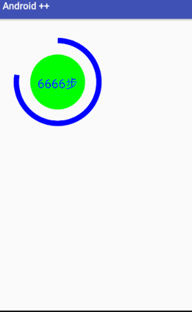
创建全新控件
过程:根据需要重写上文提到的几个方法,或者自定义属性等,重点在
onDraw() 自己绘制 View.
实现一个那啥….
1)自定义属性
<?xml version="1.0" encoding="utf-8"?>
<resources>
    <declare-styleable name="MyCustomeCircle">
        <attr name="centerX" format="float"/>
        <attr name="centerY" format="float"/>
        <attr name="circleRadius" format="float"/>
        <attr name="interval" format="float"/>
        <attr name="circleShowText" format="string"/>
    </declare-styleable>
</resources>
2)继承 View, 读取属性值,绘制所需的 View.
/**
 * author: Vecrates.
 * describe: 全新的自定义控件
 */
public class MyCustomCircle extends View{
    //内圆属性
    private float mCenterX;
    private float mCenterY;
    private float mCircleRaduis;

    private float mInterval; //弧与内圆间隔多大
    private RectF mArcRecf;

    private String mShowText;

    public MyCustomCircle(Context context, AttributeSet attrs) {
        super(context, attrs);
        TypedArray ta = context.obtainStyledAttributes(attrs, R.styleable.MyCustomeCircle);
        //圆
        mCenterX = ta.getFloat(R.styleable.MyCustomeCircle_centerX, 400);
        mCenterY = ta.getFloat(R.styleable.MyCustomeCircle_centerY, 400);
        mCircleRaduis = ta.getFloat(R.styleable.MyCustomeCircle_circleRadius, 100);

        //弧
        mInterval = ta.getFloat(R.styleable.MyCustomeCircle_interval, 50);
        //弧的外接矩形
        mArcRecf = new RectF(
                (float)(mCenterX - mCircleRaduis - mInterval),
                (float)(mCenterY - mCircleRaduis - mInterval),
                (float)(mCenterX + mCircleRaduis + mInterval),
                (float)(mCenterY + mCircleRaduis + mInterval)
        );

        mShowText = ta.getString(R.styleable.MyCustomeCircle_circleShowText);
    }

    @Override
    protected void onDraw(Canvas canvas) {
        super.onDraw(canvas);
        Paint circlePaint = new Paint();
        circlePaint.setColor(Color.GREEN);
        circlePaint.setStyle(Paint.Style.FILL);
        canvas.drawCircle(mCenterX, mCenterY, mCircleRaduis, circlePaint);

        Paint arcPaint = new Paint();
        arcPaint.setColor(Color.BLUE);
        arcPaint.setAntiAlias(true); //无锯齿
        arcPaint.setStrokeWidth(40); //线宽度
        arcPaint.setStyle(Paint.Style.STROKE);
        canvas.drawArc(mArcRecf, 270, 280, false, arcPaint);

        Paint textPaint = new Paint();
        textPaint.setColor(Color.BLUE);
        textPaint.setTextSize(90);
        textPaint.setTextAlign(Paint.Align.CENTER);
        canvas.drawText(mShowText, mCenterX, mCenterY+90/2, textPaint);
    }

}
3)使用
    <cn.vecrates.androidjinjie.MyCustomCircle
        android:layout_width="match_parent"
        android:layout_height="match_parent"
        customView:centerX="400"
        customView:centerY="400"
        customView:circleRadius="200"
        customView:interval="100"
        customView:circleShowText="6666步"
        />